Beautiful Streamlines for Visualizing 2D Vector Fields
As part of my PhD research, I measured velocity fields from a laboratory-scale model of a mountain belt in mid-collision. This post discusses some work I did to visualize the results, which I hope others my find useful – vector fields being ridiculously common in many disciplines. To cut to the chase, you can find a MATLAB implementation of the Jobard & Lefer streamline plotting algorithm at the links below, which you can use to generate plots like you see in the figure below.
Incidently, a few months after I wrote this package, I learned that my good friend Chris Thissen had been doing the same thing at the same time. It turns out that we both got the reference from our PhD advisor, decided it was useful enough to share with the world, and quietly set to work coding it up. You can find Chris’s (also excellent) implementation at the following link: estream2.
About streamlines
Streamlines are a clean and informative way to visualize the direction of a velocity field. Simply put, a streamline is a line everywhere tangent to a vector field. I will leave it at that, but not that Wikipedia provides a nice discussion (and visualization) of what streamlines are and are not (Wikipedia - Streamlines).
To draw a streamline, you pick a starting point, evaluate the vector field at that point, step forward an increment in that direction, and repeat many, many times. In other words, you numerically integrate the path from your starting point. This is typically done with a straightforward, reliable method like Runga-Kutta.
While this is not so hard to implement yourself, most scientific computing languages have tools to do the dirty work for you. For example, in MATLAB, you might use a built-in ODE solver to handle the numerical integration then plot the line manually, or call the streamline function to compute and plot the line.
One big problem remains: where should you place the start-points for your streamlines? This does not matter much for quick-and-dirty data analysis, but it should when making plots for publication. Edward Tufte, a guru of scientific visualization, said that the goal of our figures should be to achieve an “economy of understanding” for the reader. He is right, and so it is up to us to put in the work to make our figures as expressive as possible. For streamlines, this means picking start-points such that the streamlines span the data with a consistent density – which is harder than it sounds.
Bruno Jobard and Wilfred Lefer’s 1997 paper, Creating Evenly-Spaced Streamlines of Arbitrary Density, provides a neat algorithm to solve the spacing problem, and a few additional formatting tricks that make beautiful and informative streamline plots. A few years back, I implemented their algorithms in MATLAB, and posted the package to Github and the Mathworks FileExchange (see links at top). Below, I will briefly discuss the various plots it can make, and how it makes them.
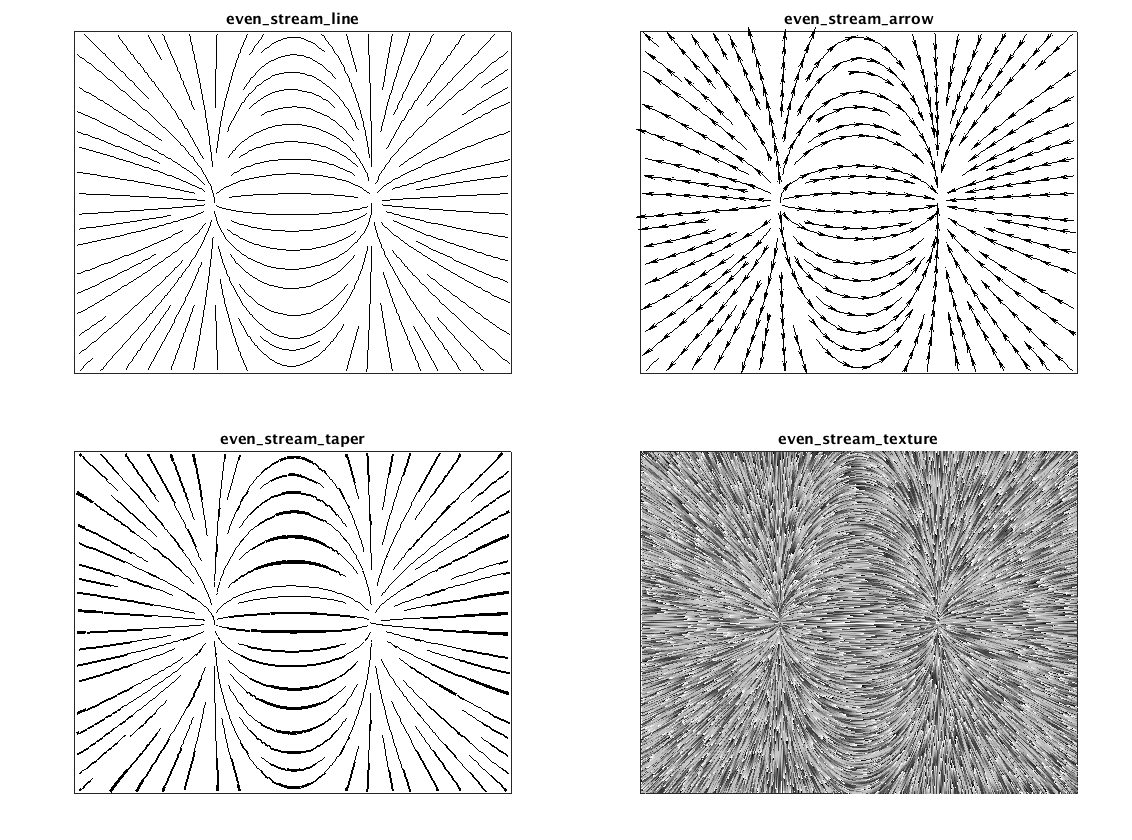
Evenly-spaced streamline plot
First the result. Using the velocity field below as an example:
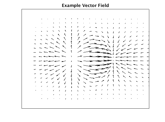
Plotting streamlines using Jobard and Lefer’s algorithms to select start and end points for each line, we get the following plot:
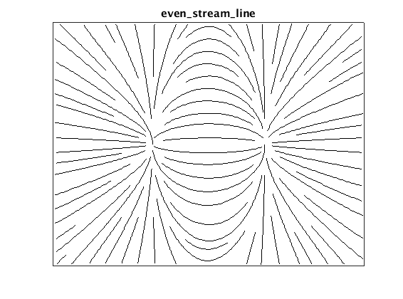
One particularly nice feature of the algorithm is that we can explicitly (and independently) set the maximum and minimum streamline spacing. This provides a lot of space for customization with minimal parameters to fiddle with.
A bit about the algorithm itself. The basic idea is simply to draw streamlines until they are too close to their neighbors, then stop. Practically, this means selecting a start point, integrating forward from that point, and checking distance to all existing streamline points at each step. New start points are selected by generating candidates at some distance from the existing streamlines, and accepting those that are sufficiently far from their neighbors. This process of generating a start point and adding a new streamline, continues until no more lines can be added at the specified minimum spacing.
Two parameters control the spacing, dsep, the minimum distance from all streamlines to the start point of a new line, and dtest the minimum distance between any streamline. The authors recommend dtest = 0.5*dsep, which means the streamline density varies over the plot – higher in regions where the streamlines converge and lower where they diverge.
All this distance-checking sounds computationally expensive! To make it feasible, the authors use a low-res grid and keep track of which “cells” contain streamlines already. Checking for neighboring streamlines then only requires checking the neighboring grid cells, instead of computing distances to all points.
It is worth noting that MATLAB’s streamslice now includes similar functionality through a single density parameter. It does not, however, provide control over both minimum and maximum density, nor the fancy plot variants below.
Streamline plot with arrow glyphs
Since simple streamlines do not indicate direction, it is useful to add arrows along their length. This can be done easily by placing glyphs at some specified distance interval along each line.
![]()
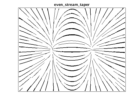
Tapered streamline plot
We can use the distance between lines to generate tapered lines, what Jobard & Lefer refer to as a “hand-drawn” style. To do this, we scale the width of the line based on distance to the nearest neighbor, up to some maximum width.
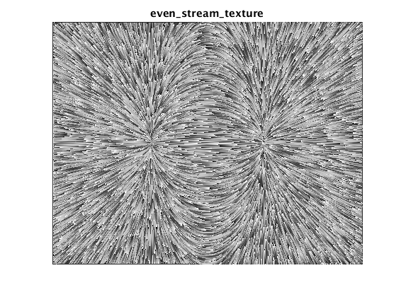
Textured streamline plot
The last option is to generate a textured plot by shading each streamline in a sawtooth-like pattern. When these shaded lines are plotted densely, the provide a quite detailed view of the vector field while still indicating flow direction. The effect is similar to the line-integral-convolution (LIC) method, but (I think) simpler to understand and implement.
References
- Jobard, B., & Lefer, W. (1997). Creating Evenly-Spaced Streamlines of Arbitrary Density. In W. Lefer & M. Grave (Eds.), Visualization in Scientific Computing ’97: Proceedings of the Eurographics Workshop in Boulogne-sur-Mer France, April 28–30, 1997 (pp. 43–55). inbook, Vienna: Springer Vienna. http://doi.org/10.1007/978-3-7091-6876-9]